If you missed Part 1 of this series, Click Here
If you missed Part 2 of this series, Click Here
I just took a five day strategy hiatus, before continuing on my 200 day of blogging adventure. I used the time to come up with some excellent strategies and deeply valuable content. So I am very happy to be back and ready to rock this! Let's go!
Step #8 - Typography Advanced Tips
and Free Fonts that You'll Love!
So we are onto the next phase of this five part series! Today we're going to get deeper into typography. Since I design for three different universities this issue comes up constantly, many students have a tendency to get lazy or scared about typography. They choose default fonts that are boring or unfitting or worse they actually choose every trendy font imaginable.
Here are some great rules to remember when choosing typography:
- Don't use more than 3 fonts in any given piece. It's best to think of them in terms of headlines, subheads, and copy. All should complement each other. They should vary -- bold for headlines, larger than copy for sub heads, and something readable for copy.
- You want the fonts to communicate the same adjectives but not be too similar
- Do not use trendy fonts for subheads or copy, headlines are best for these because headlines are larger so if a trendy font is detailed its easier to read
- Avoid super recognizable trendy fonts for logos, stick to modifying a simple font
- Use classically beautiful fonts over default fonts, default fonts are boring. (If you don't know what a default font is, it's any font that comes with your Word processing or graphic design programs) This is why the font "Papyrus" is overused for things like spas and health food shops because it was the coolest default font that was on any given Microsoft program, so because of this it has become an overused, cliche, joke of a font, with a BAD reputation!
How do I find beautiful, kick a$$ fonts?
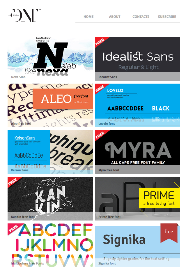
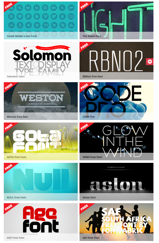
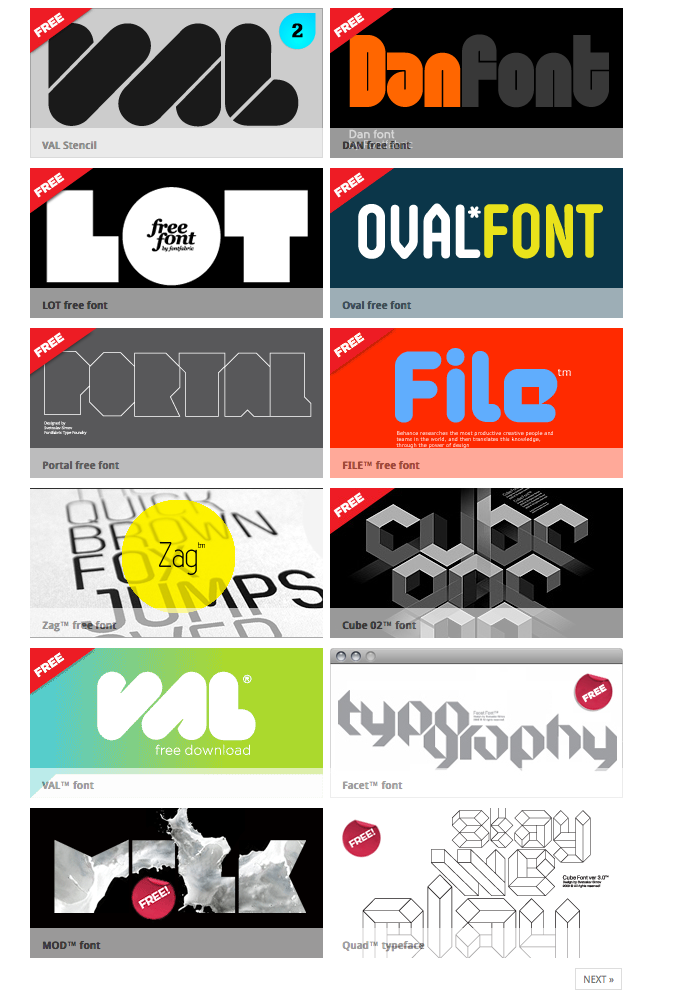
Three main sources that I used --dafont.com, fontfabric.com, and whatthefont.com, and myfonts.com
A source I would like to share with you this week is an excellent website that I found that has commercial fonts that are "Free" and ready for you to use! Make sure to read any licensing agreements when using them. Book mark this page as I would say 99% of the fonts on this page are considered excellent, which makes the decision a bit easier as you are trying to find something for your logo, website, or marketing materials.
Here is the free fonts page for Font Fabric!